- Информация о материале
- Автор: Super User
- Категория: Latest
- Просмотров: 13343
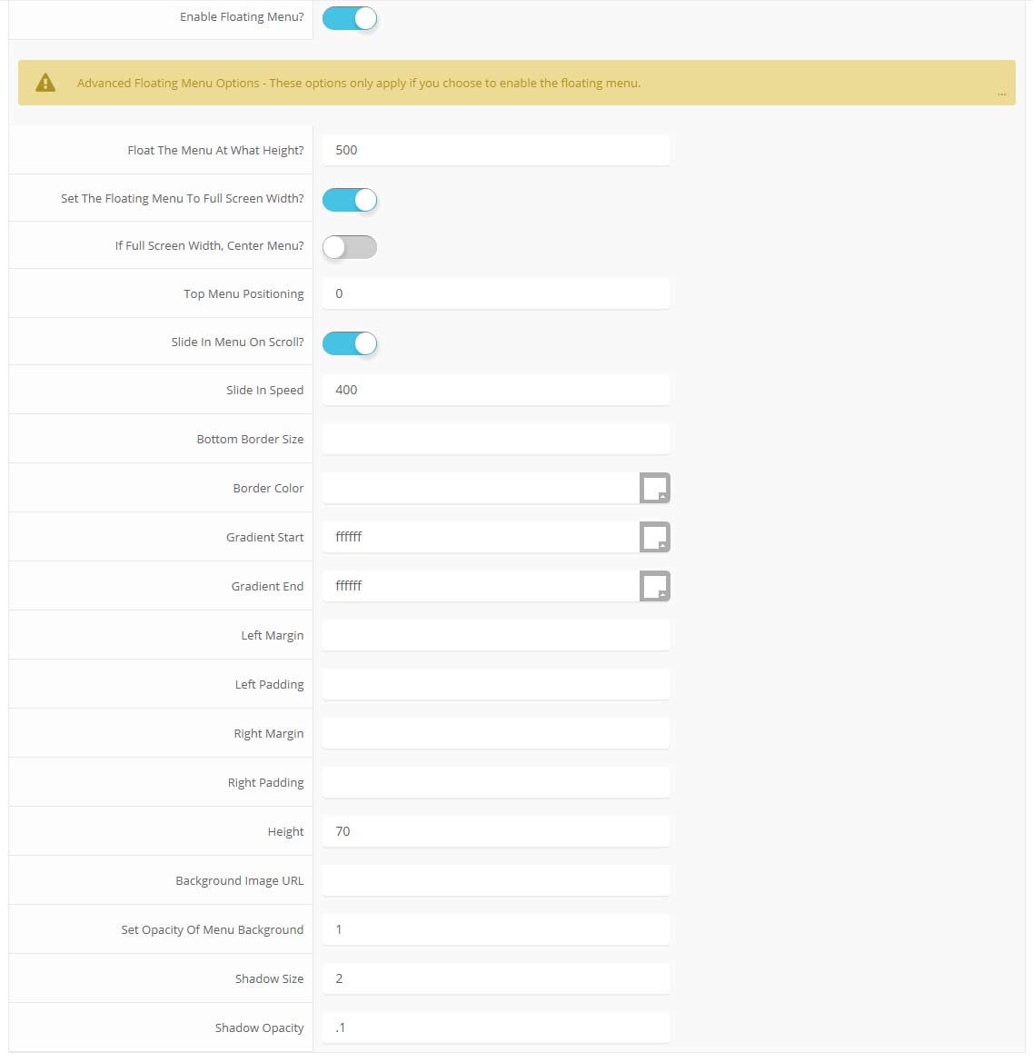
Features at a glance:
- Set a background image to the menu, gradient or solid color
- Set to snap or smooth scroll in
- Determine at which point as you scroll down your page that the menu drops in
- and many more features, just check out the screenshot below
Admin area of the Floating Menu:
- Информация о материале
- Автор: Super User
- Категория: Latest
- Просмотров: 13657
Features:
- Set the scroll speed of the images
- Set background repeat style
- Set background image size, 100%, cover, contain, etc
- Set custom backgrounds for all s5 rows in the framework.
- Enable or disable parallax on a per row basis
Admin Area Of The Backgrounds Tab:
- Информация о материале
- Автор: Super User
- Категория: Latest
- Просмотров: 12817
This template comes loaded with options that you can use to customize your site exactly how you want it. Here's how to get to these custom settings:
- In the backend of Joomla go menu item Extensions/Template Manager.
- Click on the title of the template.
- This will bring you to the template manager screen where you can edit the template's parameters.
- Click save when you are done
I like what I see! I want to JOIN TODAY.
- Информация о материале
- Автор: Super User
- Категория: Latest
- Просмотров: 13861
Note - The tool tips script is by default disabled. If you wish to use it you must enable this script in the template's configuration area. This also includes site shaper installations.
Demo 1:

Demo 2:
Demo 2 Image Tool Tip
Demo 3:
Demo 3 Image Tool Tip
- Информация о материале
- Автор: Super User
- Категория: Latest
- Просмотров: 13954
Every template built on Vertex also comes with its own unique template specific options applicable to that particular template such as highlight colors, social icons, and much more. These features are in addition to the standard functions of Vertex, and are still controlled through the very user friendly interface of Vertex. This page will document the features specific to this template.
Template Specific Configuration Interface of Vertex
Below is a screenshot that shows all the template specific features available in the user friendly Vertex admin:
Custom Highlight Colors
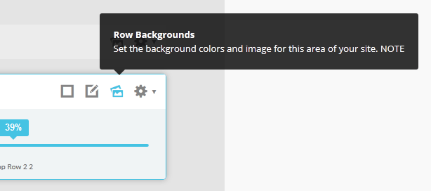
Photobox comes packed with color options to make styling a breeze. This is all made possible by the very wide variety of color configuration options shown in the screenshot above. In addition to that you can also change the color of any module row under the Backgrounds tab within Vertex. Below is an example of how these color choices work.
The colors choices you can pick from the Vertex admin are:
1. Set a custom highlight color.
2. Change the default h3 background color for modules. This also controls the content background on content h3s and the slight gradient shown on the accordion menu items.
3. Set the menu/header background color.
4. The background color for the left and right columns.
5. Custom_2 and custom_3 background colors (found in between the bottom rows).
6. Set the background of the font resizer and breadcrumbs row.
Logo Options
This template comes with the option to place the logo in either the left or column column or in the header next to the menu. Along with the placement option you can also specify a background color to be used if it's published to the column areas. Because the logo position is very unique you can also specify a different logo and background color for the mobile version of the logo, which shows in the header. Below is a screenshot showing the logo in the header.
Lowercase Leters
Choose to enable or disable lowercase letters on most menu items, buttons, titles and more.

Custom Highlight Font
Choose a custom highlight font powered by Google fonts. You can set a custom font for the S5 Flex Menu main level items, titles, buttons, and much more. This is used in conjunction with the default site font which is controlled under the Layout tab of Vertex, and controls many other elements as well.
Optional Full Width Sub Menus
On this demo you will see that the flex menu sub menus are the same width as the main content. This feature is totally optional and it can be disabled. It can also be disabled at a specific screen width, which is highly recommended to do.

Small Menu
The S5 Flex Menu gives you the ability to have subtext on each menu item. If you choose not to use subtext on the first level links simply choose to disable this option and the menu will automatically down size.

Floating Header
As you scroll down the page you will notice that the main header floats with the page. This feature is optional and can be turned off so that the menu always stays at the top of the page.Social Icons
Easily link to a social media site with the built in social icons found in the header of this template. Simply enter the url of your social site in the configuration and the icon will automatically appear. To disable an icon simply leave the url blank for that particular icon.
Сторонняя реклама
Locate Us
410 Windward Drive
Newton, KS 56798
United States
(800) 123-4561
Mon-Fri 8am-5pm
Newton, KS 56798
United States
(800) 123-4561
Mon-Fri 8am-5pm
Join Our Newsletter
Signup to get exclusive offers and other discount from us by joining our newsletter program.