- Информация о материале
- Автор: Super User
- Категория: Latest
- Просмотров: 13039
Features at a glance:
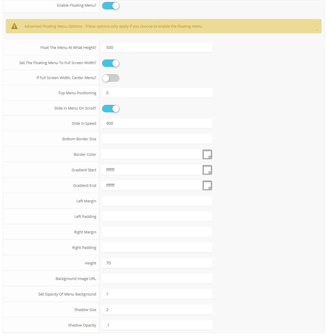
- Set a background image to the menu, gradient or solid color
- Set to snap or smooth scroll in
- Determine at which point as you scroll down your page that the menu drops in
- and many more features, just check out the screenshot below
Admin area of the Floating Menu:

- Информация о материале
- Автор: Super User
- Категория: Latest
- Просмотров: 13317
Features:
- Set the scroll speed of the images
- Set background repeat style
- Set background image size, 100%, cover, contain, etc
- Set custom backgrounds for all s5 rows in the framework.
- Enable or disable parallax on a per row basis
Admin Area Of The Backgrounds Tab:

- Информация о материале
- Автор: Super User
- Категория: Latest
- Просмотров: 13517
Demo 1:

Demo 2:
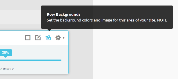
Demo 2 Image Tool Tip
Demo 3:
Demo 3 Image Tool Tip
- Информация о материале
- Автор: Super User
- Категория: Latest
- Просмотров: 12504
This template comes loaded with options that you can use to customize your site exactly how you want it. Here's how to get to these custom settings:
- In the backend of Joomla go menu item Extensions/Template Manager.
- Click on the title of the template.
- This will bring you to the template manager screen where you can edit the template's parameters.
- Click save when you are done

- Информация о материале
- Автор: Super User
- Категория: Latest
- Просмотров: 13638
Every template built on Vertex also comes with its own unique template specific options applicable to that particular template such as highlight colors, social icons, and much more. These features are in addition to the standard functions of Vertex, and are still controlled through the very user friendly interface of Vertex. This page will document the features specific to this template.
Template Specific Configuration Interface of Vertex
Below is a screenshot that shows all the template specific features available in the user friendly Vertex admin:
Custom Highlight Colors
Photobox comes packed with color options to make styling a breeze. This is all made possible by the very wide variety of color configuration options shown in the screenshot above. In addition to that you can also change the color of any module row under the Backgrounds tab within Vertex. Below is an example of how these color choices work.
The colors choices you can pick from the Vertex admin are:
1. Set a custom highlight color.
2. Change the default h3 background color for modules. This also controls the content background on content h3s and the slight gradient shown on the accordion menu items.
3. Set the menu/header background color.
4. The background color for the left and right columns.
5. Custom_2 and custom_3 background colors (found in between the bottom rows).
6. Set the background of the font resizer and breadcrumbs row.
Logo Options
This template comes with the option to place the logo in either the left or column column or in the header next to the menu. Along with the placement option you can also specify a background color to be used if it's published to the column areas. Because the logo position is very unique you can also specify a different logo and background color for the mobile version of the logo, which shows in the header. Below is a screenshot showing the logo in the header.
Lowercase Leters
Choose to enable or disable lowercase letters on most menu items, buttons, titles and more.

Custom Highlight Font
Choose a custom highlight font powered by Google fonts. You can set a custom font for the S5 Flex Menu main level items, titles, buttons, and much more. This is used in conjunction with the default site font which is controlled under the Layout tab of Vertex, and controls many other elements as well.
Optional Full Width Sub Menus
On this demo you will see that the flex menu sub menus are the same width as the main content. This feature is totally optional and it can be disabled. It can also be disabled at a specific screen width, which is highly recommended to do.

Small Menu
The S5 Flex Menu gives you the ability to have subtext on each menu item. If you choose not to use subtext on the first level links simply choose to disable this option and the menu will automatically down size.

Floating Header
As you scroll down the page you will notice that the main header floats with the page. This feature is optional and can be turned off so that the menu always stays at the top of the page.Social Icons
Easily link to a social media site with the built in social icons found in the header of this template. Simply enter the url of your social site in the configuration and the icon will automatically appear. To disable an icon simply leave the url blank for that particular icon.
- Информация о материале
- Автор: Super User
- Категория: Latest
- Просмотров: 8337
- Информация о материале
- Автор: Super User
- Категория: Latest
- Просмотров: 7930
So what are Site Shapers? They are quick installs of Joomla combined with all the modules, content, etc used on our demo, excluding stock photography. Within a few minutes you can have your site up, running and looking just like our demo. No more importing SQL dumps and installing modules. Just head on over to the download section of this template and grab a Site Shaper. Simply install the Site Shaper like any other Joomla installation, it's that easy!
How to setup a Site Shaper
- Login to your cpanel or your server admin panel.
- Locate the area where your databases are (usually labeled Mysql Databases)
- Create a new database
- Next create a new database user and assign it to this newly created database in the previous step
- You will then need to extract the site shaper to either a folder on your server or the root directory such as WWW. NOTE: if you already have a website in the root of your WWW folder, we suggest creating a new folder and extract the site shaper there. If your cpanel does not have an extract option or you cannot find it, you may also extract the contents of your site shaper in to a folder on your desktop and upload all the files via an ftp client to your server.
- Next, navigate to the url where you extracted the site shaper via your web browser.
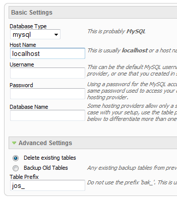
- Continue through each screen until you reach the below screenshot:
- At the above screen be sure to enter localhost as shown, continue to fill in the following text fields with your newly created database and username information
- Follow through the rest of the site shaper setup and click the install sample data at the last screen and the installation is complete! (be sure to rename/remove the installation directory after finishing the install)

- Информация о материале
- Автор: Super User
- Категория: Latest
- Просмотров: 7655
SEO - Get your site noticed!
Not only is this template beautifully designed but it is great for search engine optimization as well! What is SEO? It is simple the act of altering a web site so that it does well in the organic, crawler-based listings of search engines such as google.com. How does this template accomplish this? It's simple, the majority of your most valuable content is found in the main body of your site, through css we are able to alter the layout of the site and call the main content before the left and right columns are called. This allows for your content to be found first by search engines before it reaches your other content, which is vital in search engine optimization. This is a common feature this can be done with almost all of Shape 5 templates as well.
- Информация о материале
- Автор: Super User
- Категория: Latest
- Просмотров: 7162
The module holds up to 10 actual module positions so you can publish any of your favorite modules to one of the slides and keep your site clean and consolidated while giving it a nice effect. Simply publish the s5 tab show module to your desired module position and pages. Then start publishing modules to the positions in the tab show (s5_tab1, s5_tab2, etc); these modules will become the slides. There is also an automatic advance feature that allows you to automatically advance through the slides are your own specified interval.
- Информация о материале
- Автор: Super User
- Категория: Latest
- Просмотров: 7245
Please note that the version shown on this page is using the html setting for text along with styling specific to this template. The module has the ability for the user to submit plain text and the module will stylize the content with default settings or you can enter your own custom html. Below is a screenshot of the plain text version, which is stylized by the module. The plain text option is great for users with limited css understanding and the html setting is for advanced users.

Here is a screenshot of the html/plain text switch mentioned above

Module Features
1. Easily switch between plain text and html mode. The module will provide styling for plain text mode and html module allows you to enter your own custom html.2. Content is totally option for each slide.
3. Publish up to fifteen pictures in total.
4. Uses core Jquery calls to avoid javascript conflicts.
5. Set the width of the fluid width of the active image and the max width so that the active image will not get any larger than what is specified.
6. Set the number of seconds you would like each slide to show for.
7. Control style settings such as colors, font size, spacing, etc. for plain text mode.

Сторонняя реклама
Locate Us
Newton, KS 56798
United States
(800) 123-4561
Mon-Fri 8am-5pm